LUTHIER PARIS
Mélanie Kaltenbach
SUMMARY: This case study explores the collaborative effort undertaken by my team of three UX designers from the Ironhack bootcamp, focusing on the redesign of a Paris-based luthier's website.
Project: The project aimed to balance the dual goals of elevating the brand's appeal to professional soloists seeking custom-made instruments and streamlining the rental process for students.
Solution: By leveraging user research and innovative design strategies, we sought to create a website that resonated with both user personas, ultimately reducing the operational burden on the luthier and allowing her to refocus on her passion for handcrafting instruments.
Impact
Business growth
My Role
UX Research
Concept Design
UI Design
Timeline
10 days
Platform
Web
Introduction:
The project was initiated within the context of the Ironhack bootcamp, where teams were tasked with designing or redesigning e-commerce compatible websites. Our team, consisting of Joseph Gower, Sheng-Hao Chou, and myself, chose to partner with a Paris-based luthier, Mélanie, to enhance her online presence. A preliminary assessment of her existing website revealed significant opportunities for improvement in both UI design and user experience, particularly in accommodating her business's dual focus on instrument rentals and sales of handcrafted instruments.
Problem Identification:
Mélanie's business was at a crossroads. While rentals formed a substantial portion of her revenue, they also diverted time away from her passion and talent for crafting unique instruments—a passion reignited by the completion of her first instrument in over a decade. The primary challenge was twofold: How could the website reflect the upscale sophistication of her craftsmanship to appeal to professional musicians, and simultaneously streamline the rental process to be more intuitive for students?
User research
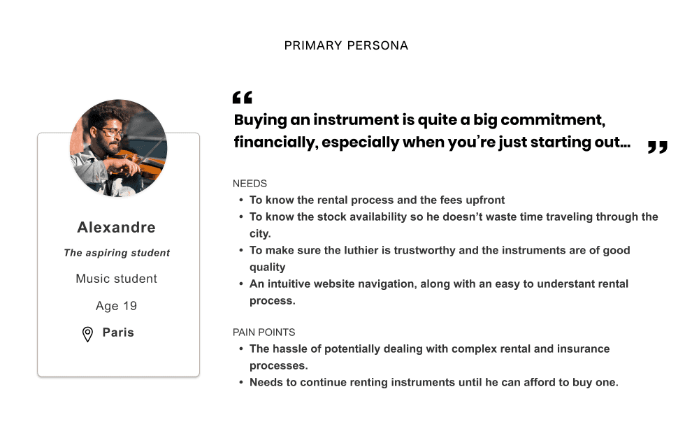
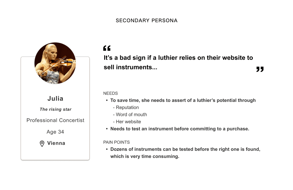
Through interviews with a wide spectrum of musicians—from parents of beginner students to internationally acclaimed soloists—our research uncovered distinct needs between the two groups. Professionals valued reputation, portfolio, and craftsmanship over online transactions, while students and their parents sought modernity, ease of use, and clear information on availability and pricing. This insight informed our approach to cater to two divergent user personas with a single, cohesive website design.
USER context
63%
Students learn about a specific violin-maker through their teacher
32%
Students learn about a specific violin maker through their website
78%
Value reputation as the most important factor when choosing a viollin maker
85%
Students take their teachers's advice when looking for a new instrument
2%
Professionals buy an instrument through a luthier's website.
Survey respondents were asked to rank the aspects that lead them to go through with a rental / or visit with the intent of purchase when browsing a violin maker's website.
students
#1
#2
#3
#4
#5
Instrument Photos/videos
Online reviews
Website UI modernity
Rewards
Intuitive rental process
professionals
#1
#2
#3
#4
#5
Reputation
Rewards
Portfolio
Biography
Instrument photos/videos
results based on 117 survey respondents
84 music students • 33 professional musicians
Strategic Approach and Solution Development
Acknowledging the dichotomy in user needs, we envisioned a website that compartmentalized the user flow, allowing professionals to access Mélanie's biography, portfolio, and accolades without being sidetracked by rental options. Conversely, the student flow was designed to be intuitive, guiding them effortlessly through the rental process. The redesign focused on refining the user journey for each persona, from selection and sizing of instruments to finalizing rental agreements via DocuSign API.
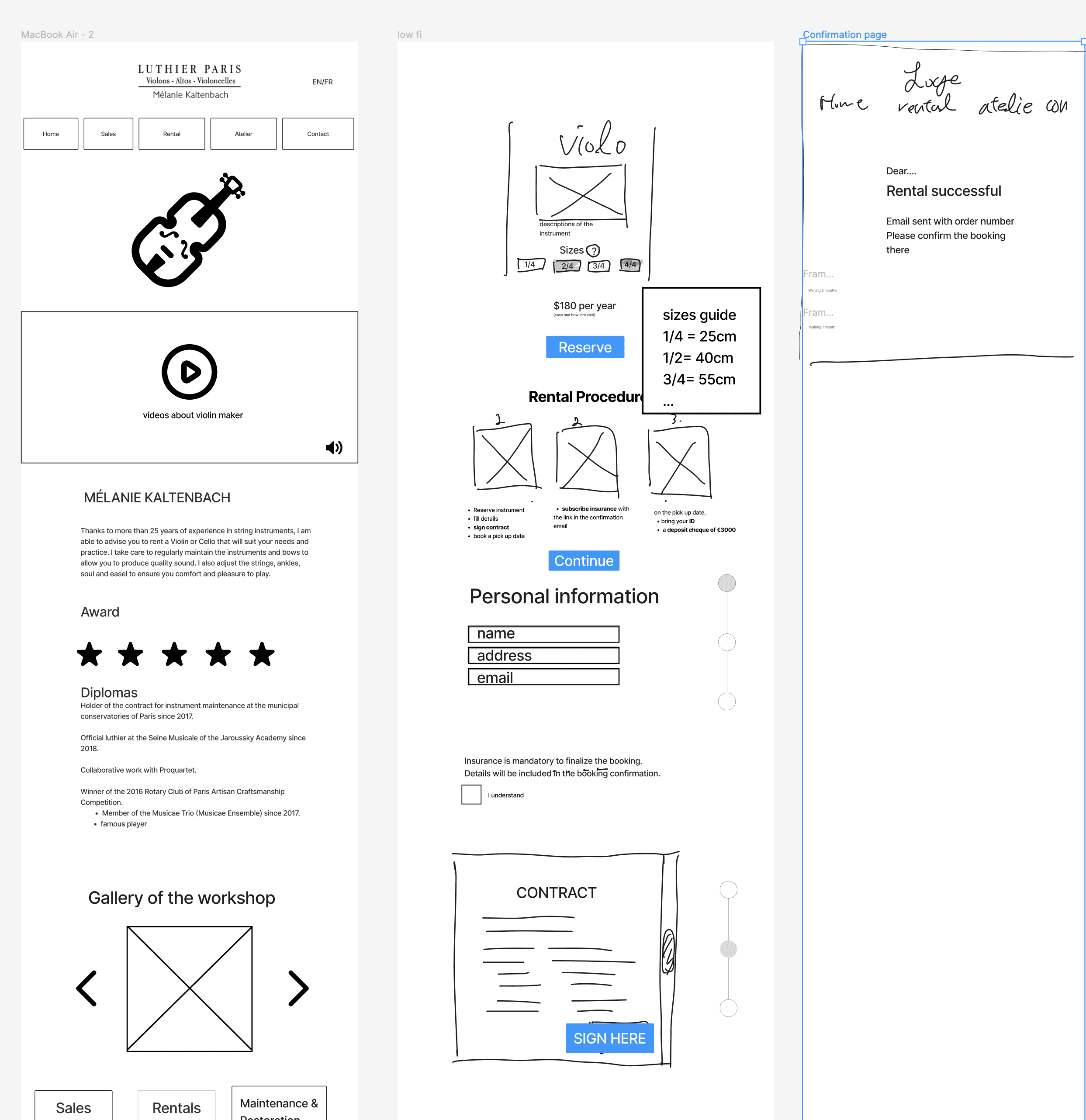
The low fidelity prototypes focused on the compartmentalization of each persona's use flow
Design and Testing
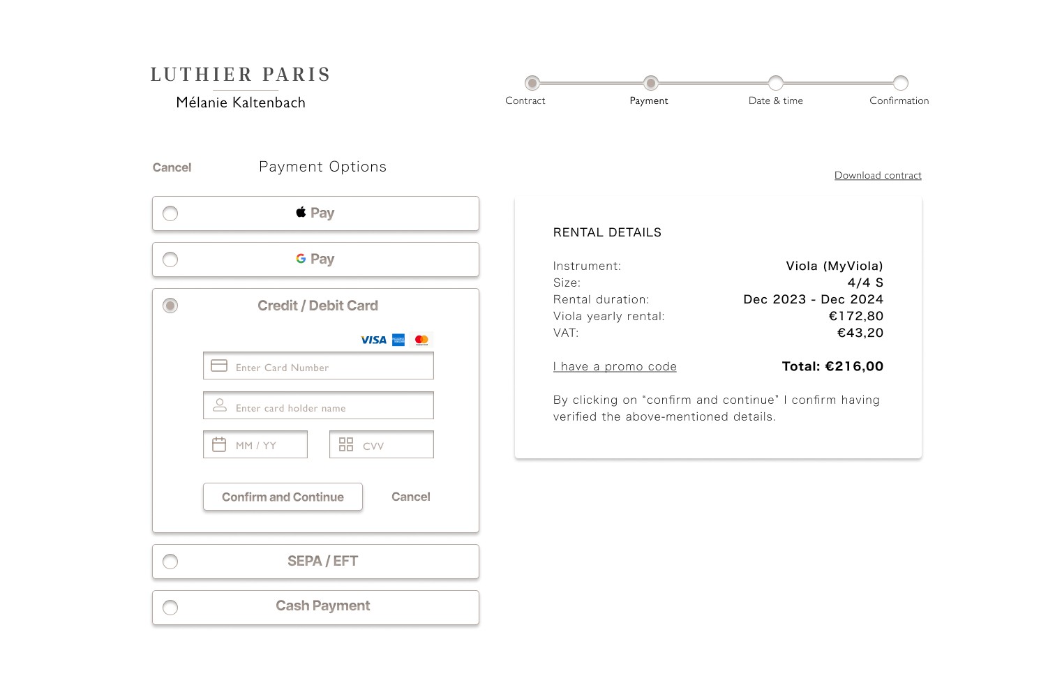
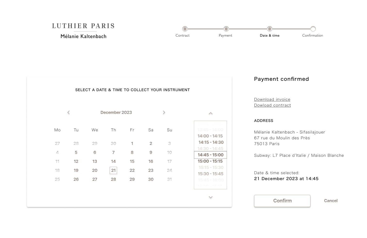
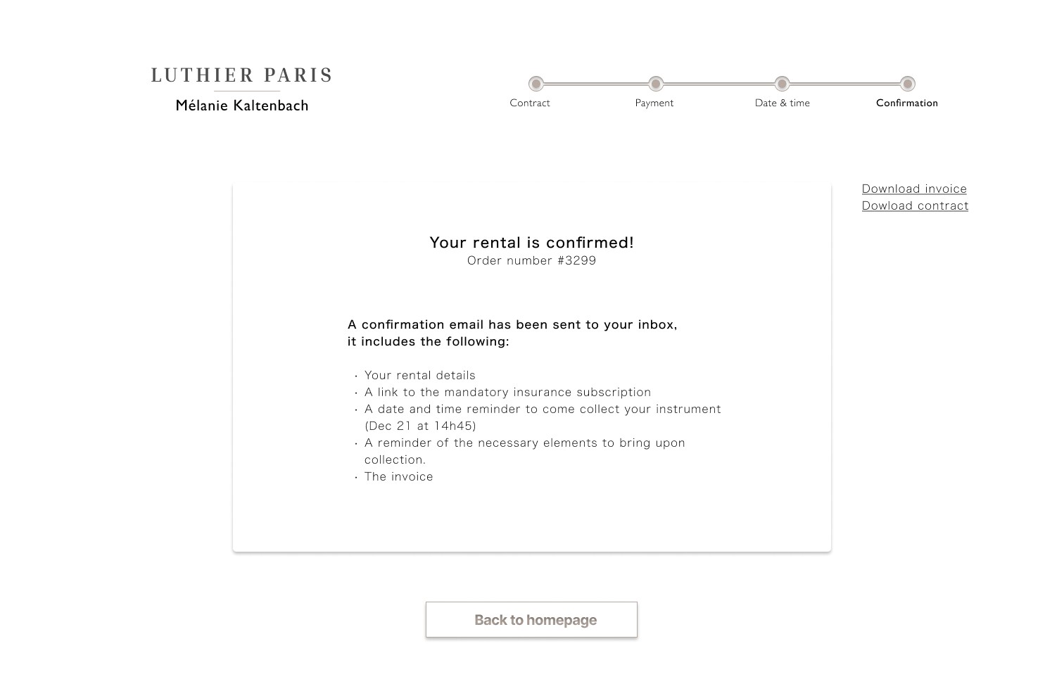
The user interface design had to strike a delicate balance between the aesthetic simplicity expected by professionals and the modern, engaging interface sought by students. Drawing inspiration from high-quality brands like Steinway Lyngdorf and utilizing visual assets from a documentary featuring Mélanie, we developed a design that echoed "welcoming, progressive & refined craftsmanship." Usability testing of our high-fidelity prototype yielded positive feedback, highlighting its refined, modern, and professional appearance.
Implementation and Impact (Projected)
The redesigned website significantly streamlined the rental process, potentially reducing Mélanie's time spent per rental from 45 to 10 minutes. This efficiency not only enhances the user experience for students but also frees Mélanie to dedicate more time to her craft. Although the final implementation and its direct impact on Mélanie's business remain to be seen, the prototype's reception has been overwhelmingly positive.
Next Steps and Future Directions
Given more time and resources, we aspired to develop a fully interactive prototype, further integrate third-party services like insurance subscriptions, and conduct additional usability testing. The project's continuation would focus on refining the accessory purchase experience and ensuring full responsiveness across devices, alongside monitoring business growth metrics and ongoing user needs.
Challenges & lessons learnt
Balancing Divergent User Needs
One of the most significant challenges was designing a website that served two distinctly different user personas: professional soloists and student renters. Each group had unique requirements and expectations, from the need for a sophisticated, portfolio-driven experience for professionals to a user-friendly, informative process for students. Balancing these needs without compromising the website’s overall coherence and user experience required careful planning and innovative design thinking.
Time and Resource Limitations
Operating within the constrained timeline of a bootcamp project, with limited access to resources and the need for rapid prototyping, put pressure on the team to make swift decisions and prioritize features effectively. Balancing ambition with the practicalities of project scope and deadlines required constant adaptation and strategic compromises.
Engagement and Feedback Collection
Ensuring meaningful engagement with the target user groups for feedback throughout the design process was challenging, especially given the niche market and the high standards of the professional soloist community. Crafting a usability testing approach that would elicit actionable insights while respecting the participants' time and expertise demanded careful planning and execution.
Conclusion
This case study exemplifies the transformative power of user-centric design in reconciling the diverse needs of professional soloists and student musicians through a meticulously redesigned website for a Paris-based luthier. Despite facing significant challenges, including balancing divergent user expectations, streamlining complex rental processes, and overcoming aesthetic and technical constraints within a tight timeline, our team delivered a solution that not only enhances user experience but also supports the luthier's business objectives. The project underscores the importance of empathy in design, rigorous user research, and the agile adaptation to feedback.


